1 件の予測に対する SHAP ウォーターフォール
苦戦している 1 つの学区について、各特性が予測される数学の成績を平均からモデルの出力までどう動かすかを示します。
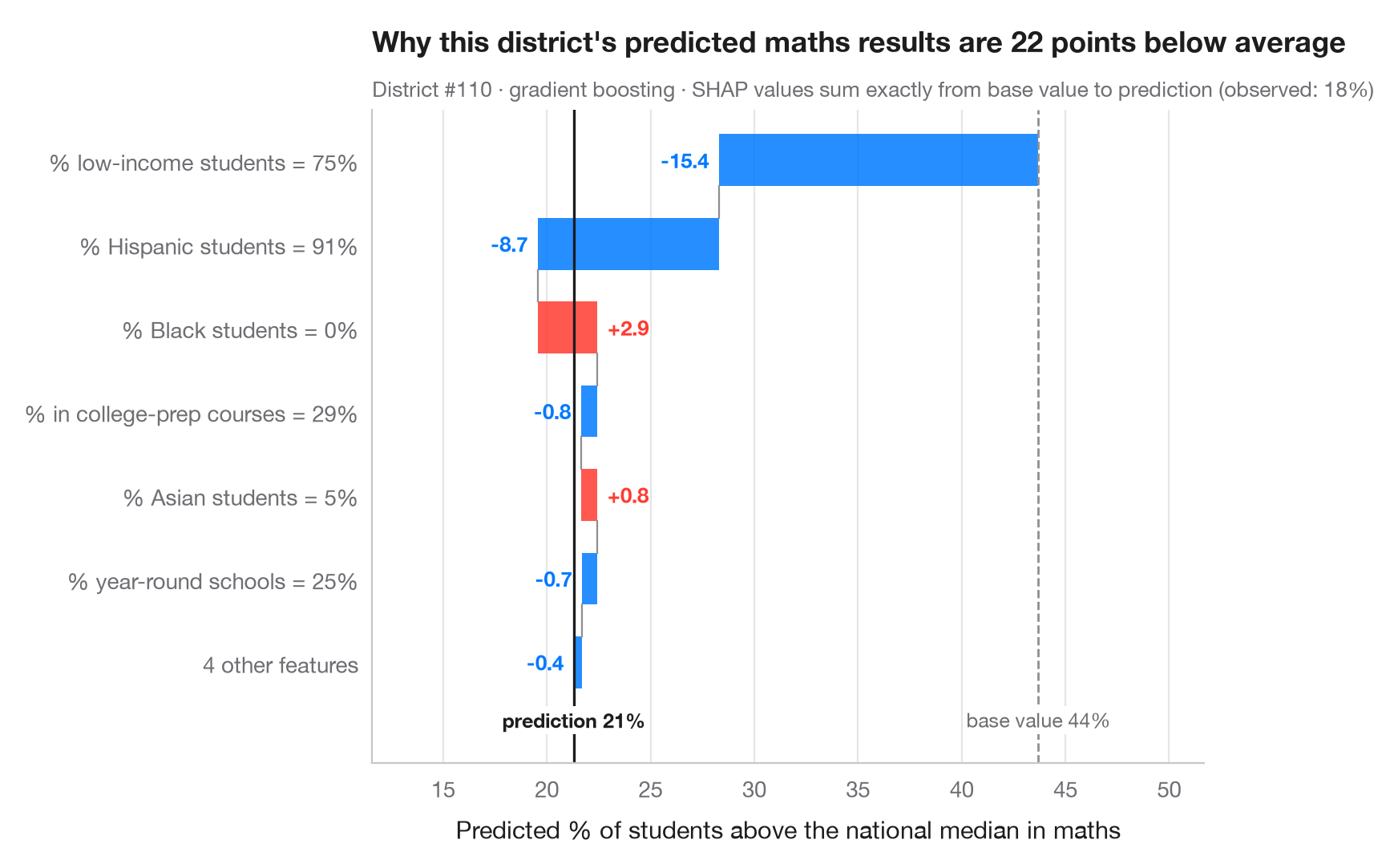
全体を描く図はモデルを説明しますが、ウォーターフォールは 1 件の 予測を説明します。ベース値(データ全体でのモデルの平均予測)から出発し、各特徴量の SHAP 値を大きい順に加えて、その学区の予測値に至ります。赤いバーは予測を押し上げ、青いバーは押し下げます。小さな寄与は 1 本にまとめて読みやすくしています。SHAP 値は加法的なので、バーの合計は常にベース値と予測値の差にぴったり一致します。
支援対象として挙がった学区、融資、給付の申請など、個別のケースを説明しなければならないときに見せる図です。説明しているのは モデル が何をしたかであって、結果がなぜ起きるかではありません。データは statsmodels 付属の 1998 年 STAR テストにおけるカリフォルニア州の学区 303 件(sm.datasets.star98)で、目的変数は数学で全国中央値を上回った生徒の割合、これを学区の 10 の特性から予測します。モデルは勾配ブースティング回帰、SHAP 値は shap.TreeExplainer によります。示している学区は苦戦しているケース(予測がベース値より 20 ポイント以上低い)で、説明が両方向に働いている例として選んでいます。
コードおよび図中のテキストは英語です。
import matplotlib.pyplot as plt
import numpy as np
import shap
import statsmodels.api as sm
from sklearn.ensemble import GradientBoostingRegressor

# Data: 303 California school districts; outcome = % of students above the national median in maths
d = sm.datasets.star98.load_pandas().data
y = 100 * d["NABOVE"] / (d["NABOVE"] + d["NBELOW"])
names = {"LOWINC": "% low-income students", "PERASIAN": "% Asian students", "PERBLACK": "% Black students",
         "PERHISP": "% Hispanic students", "AVYRSEXP": "Teacher experience (years)",
         "AVSALK": "Teacher salary ($000)", "PERSPENK": "Spending per pupil ($000)",
         "PTRATIO": "Pupils per teacher", "PCTAF": "% in college-prep courses",
         "PCTYRRND": "% year-round schools"}
X = d[list(names)]
fmt = {"LOWINC": "{:.0f}%", "PERASIAN": "{:.0f}%", "PERBLACK": "{:.0f}%", "PERHISP": "{:.0f}%",
       "AVYRSEXP": "{:.1f}", "AVSALK": "{:.1f}", "PERSPENK": "{:.2f}", "PTRATIO": "{:.1f}",
       "PCTAF": "{:.0f}%", "PCTYRRND": "{:.0f}%"}
model = GradientBoostingRegressor(learning_rate=0.05, n_estimators=300, max_depth=2,
                                  subsample=0.8, random_state=0).fit(X, y)

explainer = shap.TreeExplainer(model)
base = float(np.ravel(explainer.expected_value)[0])
all_sv = explainer.shap_values(X)
# A struggling district whose explanation has pushes in both directions
low = np.where(all_sv.sum(axis=1) < -20)[0]
p = int(low[np.argmax(all_sv[low].max(axis=1))])
sv = all_sv[p]

# Largest contributions first; pool the rest
k = 6
idx = np.argsort(np.abs(sv))[::-1]
top, rest = idx[:k], idx[k:]
labels = [f"{names[X.columns[j]]} = {fmt[X.columns[j]].format(X.iloc[p, j])}" for j in top]
values = list(sv[top])
if len(rest):
    labels.append(f"{len(rest)} other features")
    values.append(sv[rest].sum())

fig, ax = plt.subplots(figsize=(8, 5.2))
start = base
for i, (lab, v) in enumerate(zip(labels, values)):
    c = "#FF3B30" if v > 0 else "#007AFF"
    ax.barh(i, v, left=start, color=c, alpha=0.85, height=0.62)
    ax.text(start + v + (0.5 if v > 0 else -0.5), i, f"{v:+.1f}", va="center",
            ha="left" if v > 0 else "right", fontsize=9.5, color=c, fontweight="semibold")
    if i < len(values) - 1:
        ax.plot([start + v] * 2, [i + 0.31, i + 0.69], color="#8E8E93", lw=0.8)
    start += v
ax.axvline(base, color="#8E8E93", ls="--", lw=1)
ax.axvline(start, color="#1d1d1f", lw=1.2)
bottom = len(labels) - 0.45
ax.text(base, bottom, f"base value {base:.0f}%", ha="center", va="top", fontsize=9, color="#6E6E73",
        bbox=dict(fc="white", ec="none", pad=1))
ax.text(start, bottom, f"prediction {start:.0f}%", ha="center", va="top", fontsize=9,
        color="#1d1d1f", fontweight="semibold", bbox=dict(fc="white", ec="none", pad=1))
ax.set_yticks(range(len(labels)), labels)
ax.set_ylim(len(labels) + 0.2, -0.6)
lo_x = min(base, *(base + np.cumsum(values)))
ax.set_xlim(lo_x - 8, max(base, *(base + np.cumsum(values))) + 8)
ax.set_xlabel("Predicted % of students above the national median in maths")
ax.grid(axis="x"); ax.grid(axis="y", visible=False)
ax.set_title(f"Why this district's predicted maths results are {base - start:.0f} points below average", pad=26)
ax.text(0, 1.02, f"District #{p} · gradient boosting · SHAP values sum exactly from base value to prediction "
        f"(observed: {y.iloc[p]:.0f}%)", transform=ax.transAxes, fontsize=9.5, color="#6E6E73")
plt.show()
図にはオプションの PyStatlas スタイル を使用しています。同じ見た目にするには plt.style.use("pystatlas.mplstyle") を追加してください。
データの出典
- California STAR test results, 1998 (303 school districts). Gill, J. (2001). Generalized Linear Models: A Unified Approach (Quantitative Applications in the Social Sciences, No. 134). Sage. https://www.statsmodels.org/stable/datasets/generated/star98.html
Original data from the California Department of Education's Standardized Testing and Reporting (STAR) program, 1998. Subset distributed with statsmodels (sm.datasets.star98) with the author's permission.
これらの例は統計手法を説明するためのものです。図のタイトルは、この特定のデータ(多くは小規模で、古く、部分的な標本)で図が示す内容を述べたものであり、実質的な問いに対する著者の立場ではありません。解釈、背景、データの質については、ここに挙げた元の出典を参照してください。
引用方法
PyStatlas は Thierry Warin が作成・運営しています。研究や業務に役立った場合は、ぜひ引用してください。
Warin, T. (2026). SHAP waterfall for one prediction. In PyStatlas: A Python Gallery of Statistical Graphics for the Social Sciences. https://warint.github.io/pystatlas/machine-learning/shap-waterfall/
@misc{warin2026statlas,
  author       = {Warin, Thierry},
  title        = {PyStatlas: A Python Gallery of Statistical Graphics for the Social Sciences},
  year         = {2026},
  howpublished = {\url{https://warint.github.io/pystatlas/}},
  note         = {Source code: https://github.com/warint/pystatlas}
}機械学習のその他のグラフ
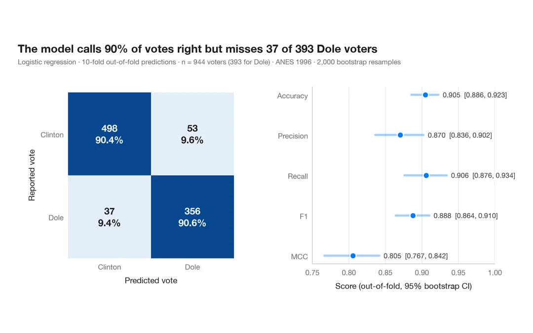
指標付き混同行列
1996 年にドールに投票した人をロジスティック回帰がどれだけ当てられるか。件数と行ごとの割合を示す交差検証の混同行列に、主要指標のブートストラップ区間を添えます。
yardstick::conf_mat() + autoplot()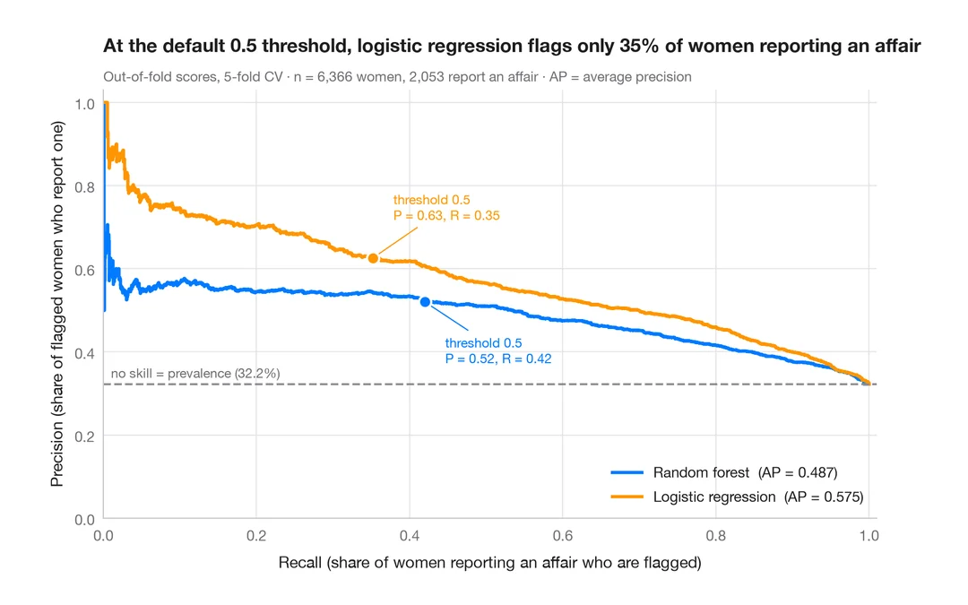
適合率–再現率曲線
既婚女性のうち誰が婚外関係を申告するかを予測する 2 つの分類器の、交差検証による適合率–再現率曲線と、平均適合率、無技能のベースライン。
yardstick::pr_curve() + autoplot()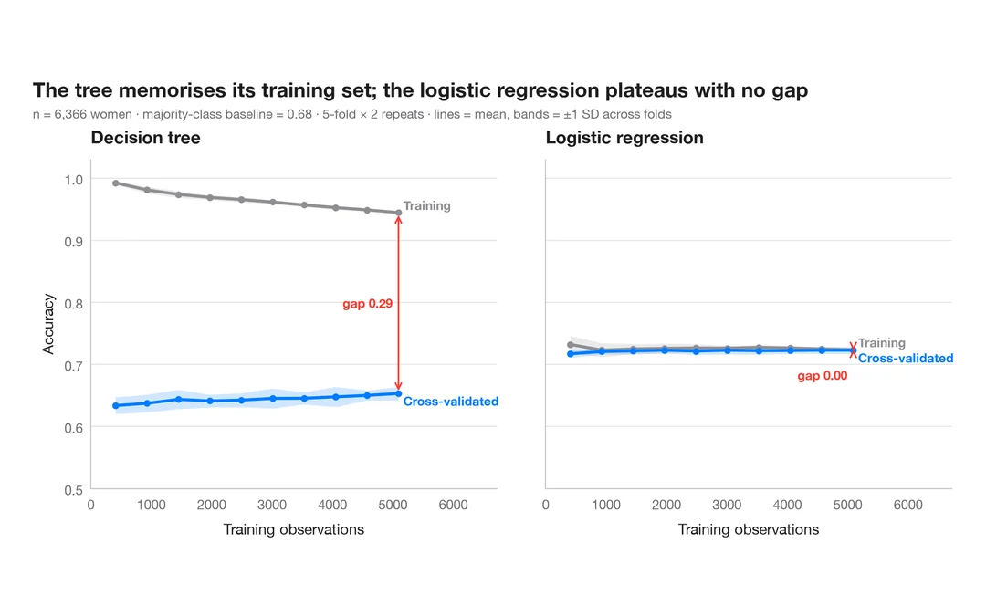
学習曲線
既婚女性のうち誰が婚外関係を申告するかを予測する 2 つのモデルについて、訓練データを増やしたときの訓練正解率と交差検証正解率を示します。
caret::learning_curve_dat() + ggplot()