SHAP 依赖图
低收入学生占比如何影响每个学区预测的数学成绩,按其最强交互特征着色,并附平滑趋势线。
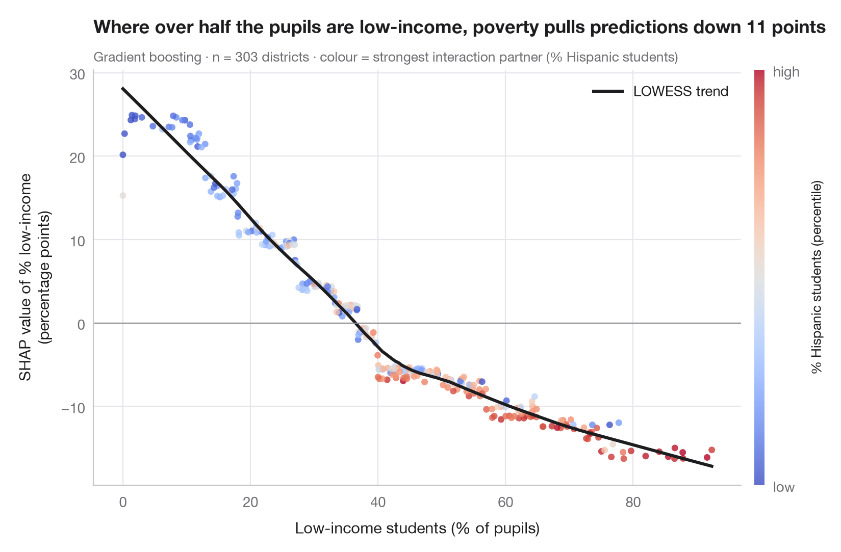
SHAP 依赖图聚焦于单个特征。每个点是一个学区:横轴为该特征的取值,纵轴为其 SHAP 值——它对这个学区预测的贡献。趋势线(LOWESS 平滑)接近部分依赖曲线,但其周围的点云同样有信息量:在低收入学生占比相同的情况下,由于与其他特征的 交互作用,不同学区的贡献并不相同。
颜色表示最能解释这种纵向离散的特征,这里选取与低收入学生占比的 SHAP 交互 值平均最大的那个特征(shap.TreeExplainer.shap_interaction_values)。这里它是西班牙裔学生占比,而它本身与贫困高度相关(r ≈ 0.7),因此颜色渐变在一定程度上反映的是这种相关性,而非交互作用。数据为 statsmodels 自带的 1998 年 STAR 考试中加利福尼亚州 303 个学区(sm.datasets.star98);结果变量为数学成绩高于全国中位数的学生占比,由学区的十项特征预测。模型为梯度提升回归;平滑来自 statsmodels.nonparametric.lowess。
代码及图中文字均为英文。
import matplotlib.pyplot as plt
import numpy as np
import shap
import statsmodels.api as sm
from sklearn.ensemble import GradientBoostingRegressor
from statsmodels.nonparametric.smoothers_lowess import lowess

# Data: 303 California school districts; outcome = % of students above the national median in maths
d = sm.datasets.star98.load_pandas().data
y = 100 * d["NABOVE"] / (d["NABOVE"] + d["NBELOW"])
names = {"LOWINC": "% low-income students", "PERASIAN": "% Asian students", "PERBLACK": "% Black students",
         "PERHISP": "% Hispanic students", "AVYRSEXP": "Teacher experience (years)",
         "AVSALK": "Teacher salary ($000)", "PERSPENK": "Spending per pupil ($000)",
         "PTRATIO": "Pupils per teacher", "PCTAF": "% in college-prep courses",
         "PCTYRRND": "% year-round schools"}
X = d[list(names)]
model = GradientBoostingRegressor(learning_rate=0.05, n_estimators=300, max_depth=2,
                                  subsample=0.8, random_state=0).fit(X, y)

explainer = shap.TreeExplainer(model)
sv = explainer.shap_values(X)
inter = explainer.shap_interaction_values(X)            # (districts, features, features)

f = list(X.columns).index("LOWINC")
strength = np.abs(inter[:, f, :]).mean(axis=0)
strength[f] = 0
partner = int(np.argmax(strength))                       # strongest interaction partner

x, s = X.iloc[:, f].to_numpy(), sv[:, f]
col = X.iloc[:, partner].rank(pct=True).to_numpy()
trend = lowess(s, x, frac=0.35)

fig, ax = plt.subplots(figsize=(8, 5.2))
sc = ax.scatter(x, s, c=col, cmap="coolwarm", s=22, alpha=0.8, lw=0, vmin=0, vmax=1)
ax.plot(trend[:, 0], trend[:, 1], color="#1d1d1f", lw=2.2, label="LOWESS trend")
ax.axhline(0, color="#8E8E93", lw=0.8)
ax.set_xlabel("Low-income students (% of pupils)")
ax.set_ylabel("SHAP value of % low-income\n(percentage points)")
ax.grid(axis="x")
ax.legend(loc="upper right")
cb = fig.colorbar(sc, ax=ax, pad=0.02, aspect=40, ticks=[0, 1])
cb.ax.set_yticklabels(["low", "high"])
cb.set_label(f"{names[X.columns[partner]]} (percentile)", fontsize=9.5)
cb.outline.set_visible(False)

above = s[x > 50].mean()
ax.set_title(f"Where over half the pupils are low-income, poverty pulls predictions down {-above:.0f} points", pad=26)
ax.text(0, 1.02, f"Gradient boosting · n = {len(X)} districts · colour = strongest interaction "
        f"partner ({names[X.columns[partner]]})", transform=ax.transAxes, fontsize=9.5, color="#6E6E73")
plt.show()
图表使用了可选的 PyStatlas 样式:添加 plt.style.use("pystatlas.mplstyle") 即可完全还原其外观。
数据来源
- California STAR test results, 1998 (303 school districts). Gill, J. (2001). Generalized Linear Models: A Unified Approach (Quantitative Applications in the Social Sciences, No. 134). Sage. https://www.statsmodels.org/stable/datasets/generated/star98.html
Original data from the California Department of Education's Standardized Testing and Reporting (STAR) program, 1998. Subset distributed with statsmodels (sm.datasets.star98) with the author's permission.
这些示例用于说明统计方法。图表标题描述的是该图在这些特定数据中呈现的内容——这些数据往往样本较小、年代较早或并不完整——而不是作者对实质问题的立场。关于解释、背景和数据质量,请以此处引用的原始来源为准。
如何引用
PyStatlas 由 Thierry Warin 创建并维护。如果它对你的工作有所帮助,敬请引用。
Warin, T. (2026). SHAP dependence plot. In PyStatlas: A Python Gallery of Statistical Graphics for the Social Sciences. https://warint.github.io/pystatlas/machine-learning/shap-dependence/
@misc{warin2026statlas,
  author       = {Warin, Thierry},
  title        = {PyStatlas: A Python Gallery of Statistical Graphics for the Social Sciences},
  year         = {2026},
  howpublished = {\url{https://warint.github.io/pystatlas/}},
  note         = {Source code: https://github.com/warint/pystatlas}
}