Kaplan–Meier 生存曲线
政治领导人在任多久:民主政体与非民主政体对比——附置信带、删失标记、log-rank 检验和风险人数表的生存曲线。
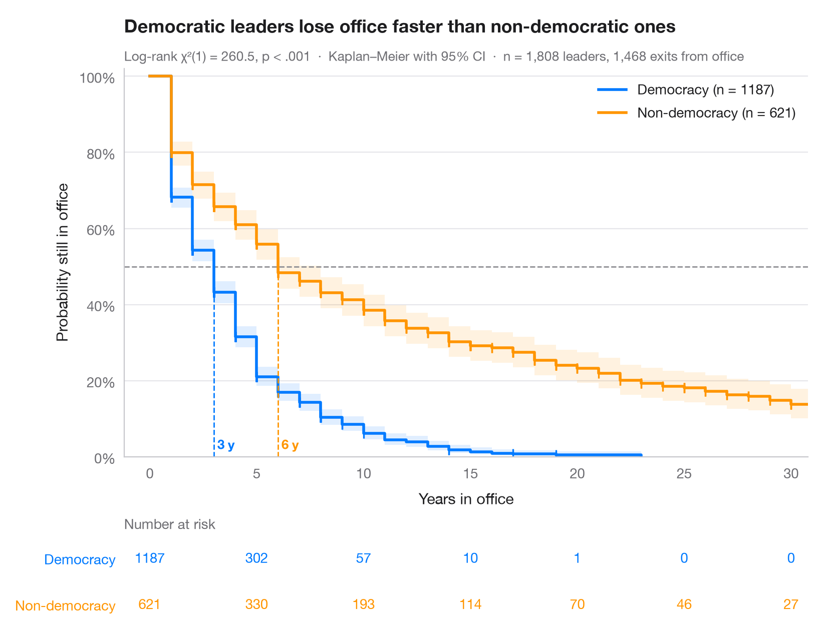
Kaplan–Meier 估计量将随访时间——有的以事件结束,有的被删失——转换为一条阶梯曲线,表示“存活”超过每个时间点的概率。阴影带为逐点 95% 置信区间,短竖线标记被删失的任期,虚线从 50% 处下落至各组的中位生存时间。下方的表格给出仍处于风险中的人数,据此可以判断每条曲线的尾部有多少数据支撑。
数据为 lifelines 自带的 Cheibub、Gandhi 和 Vreeland 的 Democracy and Dictatorship 数据集(lifelines.datasets.load_dd):1946–2008 年间 202 个国家政府首脑的 1,808 段任期,以年计。事件为离任;未观察到离任的任期——例如数据结束时仍在继续的任期——作删失处理。民主政体领导人达到中位任期的速度是非民主政体领导人的两倍。横轴截止于 30 年;没有任何民主政体的任期超过 23 年。曲线来自 KaplanMeierFitter,比较来自 logrank_test。
代码及图中文字均为英文。
import matplotlib.pyplot as plt
import numpy as np
from lifelines import KaplanMeierFitter
from lifelines.datasets import load_dd
from lifelines.statistics import logrank_test

# Data: years in office of 1,808 political leaders, by regime type
df = load_dd()
groups = {"Democracy": df[df.democracy == "Democracy"],
          "Non-democracy": df[df.democracy == "Non-democracy"]}
colors = ["#007AFF", "#FF9500"]
ticks = np.arange(0, 31, 5)

fig, (ax, tab) = plt.subplots(2, 1, figsize=(8, 6.2), sharex=True,
                              gridspec_kw=dict(height_ratios=[4.2, 1]))

# Kaplan–Meier fit per group: step curve, CI band, censoring ticks, median line
for (name, d), c in zip(groups.items(), colors):
    km = KaplanMeierFitter().fit(d.duration, d.observed, label=name)
    sf, ci = km.survival_function_[name], km.confidence_interval_
    ax.step(sf.index, sf, where="post", color=c, lw=2, label=f"{name} (n = {len(d)})")
    ax.fill_between(ci.index, ci.iloc[:, 0], ci.iloc[:, 1], step="post", color=c, alpha=0.12, lw=0)
    cens = d.loc[d.observed == 0, "duration"]
    ax.plot(cens, km.survival_function_at_times(cens), "|", color=c, ms=7, mew=1.2)
    med = km.median_survival_time_
    ax.plot([med, med], [0, 0.5], ls="--", lw=1, color=c)
    ax.text(med, 0.02, f" {med:.0f} y", color=c, fontsize=9.5, fontweight="semibold", ha="left")
    # Number at risk under the plot
    at_risk = [(d.duration >= t).sum() for t in ticks]
    for t, n in zip(ticks, at_risk):
        tab.text(t, 1 - list(groups).index(name), n, ha="center", va="center", color=c, fontsize=10)

ax.axhline(0.5, color="#8E8E93", lw=1, ls="--", zorder=1)
ax.set(ylim=(0, 1.02), xlim=(-1.2, 30.8), ylabel="Probability still in office", xlabel="Years in office")
ax.tick_params(labelbottom=True)
ax.yaxis.set_major_formatter(plt.matplotlib.ticker.PercentFormatter(1))
ax.legend(loc="upper right")

# Log-rank test
dem, non = groups["Democracy"], groups["Non-democracy"]
lr = logrank_test(dem.duration, non.duration, dem.observed, non.observed)
p_txt = "p < .001" if lr.p_value < 0.001 else f"p = {lr.p_value:.3f}"
ax.set_title("Democratic leaders lose office faster than non-democratic ones", pad=26)
ax.text(0, 1.02, f"Log-rank χ²(1) = {lr.test_statistic:.1f}, {p_txt}  ·  "
        f"Kaplan–Meier with 95% CI  ·  n = {len(df):,} leaders, {df.observed.sum():,} exits from office",
        transform=ax.transAxes, fontsize=9.5, color="#6E6E73")

# Risk table styling
tab.set(ylim=(-0.5, 1.5), xticks=ticks)
tab.tick_params(labelbottom=False)
tab.set_yticks([1, 0], list(groups))
for lbl, c in zip(tab.get_yticklabels(), colors):
    lbl.set_color(c)
tab.grid(False)
tab.spines[["left", "bottom"]].set_visible(False)
tab.set_title("Number at risk", fontsize=10, fontweight="normal", color="#6E6E73", pad=4)
plt.show()
图表使用了可选的 PyStatlas 样式:添加 plt.style.use("pystatlas.mplstyle") 即可完全还原其外观。
数据来源
- Democracy and Dictatorship: leader spells, 1946–2008. Cheibub, J. A., Gandhi, J., & Vreeland, J. R. (2010). Democracy and dictatorship revisited. Public Choice, 143(1–2), 67–101. https://doi.org/10.1007/s11127-009-9491-2
202 countries; distributed with lifelines (lifelines.datasets.load_dd).
这些示例用于说明统计方法。图表标题描述的是该图在这些特定数据中呈现的内容——这些数据往往样本较小、年代较早或并不完整——而不是作者对实质问题的立场。关于解释、背景和数据质量,请以此处引用的原始来源为准。
如何引用
PyStatlas 由 Thierry Warin 创建并维护。如果它对你的工作有所帮助,敬请引用。
Warin, T. (2026). Kaplan–Meier curves. In PyStatlas: A Python Gallery of Statistical Graphics for the Social Sciences. https://warint.github.io/pystatlas/survival/kaplan-meier/
@misc{warin2026statlas,
  author       = {Warin, Thierry},
  title        = {PyStatlas: A Python Gallery of Statistical Graphics for the Social Sciences},
  year         = {2026},
  howpublished = {\url{https://warint.github.io/pystatlas/}},
  note         = {Source code: https://github.com/warint/pystatlas}
}