PCA 双标图
美国各州及其社会指标在前两个主成分上的位置。
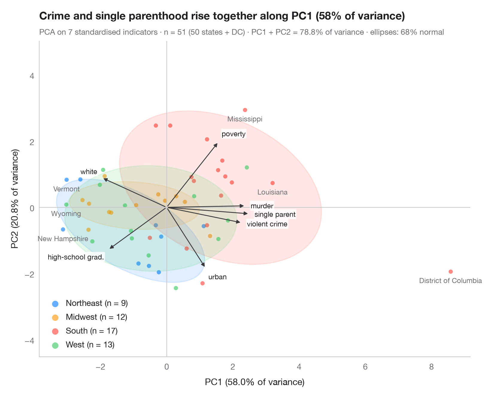
双标图在同一个主成分平面上叠加两样东西:得分(每个观测一个点,按组着色,并为每组绘制 68% 正态椭圆)和载荷(每个变量一支箭头)。指向相同方向的箭头表示变量正相关;箭头越长,对所示两个主成分的贡献越大;各组位于其取值较高的变量一侧。
数据为 statsmodels statecrime 数据集中的美国 50 个州和哥伦比亚特区(2009 年数据):每 10 万人暴力犯罪率和谋杀率、高中毕业生比例、贫困线以下人口比例、单亲家庭比例、白人比例和城市人口比例。各州按美国人口普查局的区域着色,并标注了最极端的 6 个州。变量经标准化后,由 sklearn.decomposition.PCA 计算得分、载荷以及标注在各坐标轴上的方差占比。
代码及图中文字均为英文。
import matplotlib.pyplot as plt
import numpy as np
import statsmodels.api as sm
from matplotlib.patches import Ellipse
from scipy import stats
from sklearn.decomposition import PCA
from sklearn.preprocessing import StandardScaler

# Data: 7 social indicators of 51 US states (incl. DC), standardised
df = sm.datasets.statecrime.load_pandas().data
states = df.index.str.strip()
X = StandardScaler().fit_transform(df)
regions = {"Northeast": ["Connecticut", "Maine", "Massachusetts", "New Hampshire", "New Jersey",
                         "New York", "Pennsylvania", "Rhode Island", "Vermont"],
           "Midwest": ["Illinois", "Indiana", "Iowa", "Kansas", "Michigan", "Minnesota", "Missouri",
                       "Nebraska", "North Dakota", "Ohio", "South Dakota", "Wisconsin"],
           "West": ["Alaska", "Arizona", "California", "Colorado", "Hawaii", "Idaho", "Montana",
                    "Nevada", "New Mexico", "Oregon", "Utah", "Washington", "Wyoming"]}
groups = np.array([next((r for r, s in regions.items() if st in s), "South") for st in states])
names = ["violent crime", "murder", "high-school grad.", "poverty", "single parent",
         "white", "urban"]

pca = PCA(n_components=2).fit(X)
scores = pca.transform(X)
loadings = pca.components_.T * np.sqrt(pca.explained_variance_)  # variable–PC correlations
var = pca.explained_variance_ratio_ * 100

fig, ax = plt.subplots(figsize=(8, 6.4))
ax.axhline(0, color="#C7C7CC", lw=0.8); ax.axvline(0, color="#C7C7CC", lw=0.8)
r68 = np.sqrt(stats.chi2.ppf(0.68, df=2))
for g, c in zip(["Northeast", "Midwest", "South", "West"], ["#007AFF", "#FF9500", "#FF3B30", "#34C759"]):
    s = scores[groups == g]
    ax.scatter(*s.T, s=26, color=c, alpha=0.6, lw=0, label=f"{g} (n = {len(s)})")
    # 68% normal-theory ellipse from the group covariance
    vals, vecs = np.linalg.eigh(np.cov(s.T))
    angle = np.degrees(np.arctan2(vecs[1, 1], vecs[0, 1]))
    ax.add_patch(Ellipse(s.mean(0), *(2 * r68 * np.sqrt(vals[::-1])), angle=angle,
                         facecolor=c, alpha=0.12, edgecolor=c, lw=1.2))

# Name the six states farthest from the centre
for i in np.argsort(-np.hypot(*scores.T))[:6]:
    ax.annotate(states[i], scores[i], xytext=(0, -6), textcoords="offset points", fontsize=8.5,
                color="#6E6E73", ha="center", va="top")

# Loading arrows, scaled to the narrower side of the score cloud
scale = 0.85 * np.abs(scores).max(axis=0).min() / np.abs(loadings).max()
for (x, y), name in zip(loadings * scale, names):
    ax.annotate("", (x, y), (0, 0), arrowprops=dict(arrowstyle="-|>", color="#3A3A3C",
                                                    lw=1, mutation_scale=9))
    u = np.array([x, y]) / np.hypot(x, y)  # label just beyond the arrow tip
    dx, dy = 6 * u
    ax.annotate(name, (x, y), xytext=(dx, dy), textcoords="offset points", fontsize=8.5,
                color="#1D1D1F", ha="left" if u[0] > 0.3 else "right" if u[0] < -0.3 else "center",
                va="bottom" if u[1] > 0.3 else "top" if u[1] < -0.3 else "center",
                bbox=dict(boxstyle="round,pad=0.12", fc="white", ec="none", alpha=0.8))

ax.set_xlabel(f"PC1 ({var[0]:.1f}% of variance)")
ax.set_ylabel(f"PC2 ({var[1]:.1f}% of variance)")
ax.grid(False)
ax.set_aspect("equal", adjustable="datalim")
ax.legend(loc="lower left", markerscale=1.5, handletextpad=0.3)
ax.set_title(f"Crime and single parenthood rise together along PC1 ({var[0]:.0f}% of variance)",
             pad=26)
ax.text(0, 1.02, f"PCA on {X.shape[1]} standardised indicators · n = {len(X)} (50 states + DC) · "
        f"PC1 + PC2 = {var.sum():.1f}% of variance · ellipses: 68% normal", transform=ax.transAxes,
        fontsize=9.5, color="#6E6E73")
plt.show()
图表使用了可选的 PyStatlas 样式:添加 plt.style.use("pystatlas.mplstyle") 即可完全还原其外观。
数据来源
- US state crime and social indicators, 2009. U.S. Census Bureau. Statistical Abstract of the United States, state tables for 2009 (crime rates from the FBI Uniform Crime Reporting program). https://www.statsmodels.org/stable/datasets/generated/statecrime.html
Compiled for statsmodels (sm.datasets.statecrime); public domain. See the statsmodels page for each variable's table and footnotes.
这些示例用于说明统计方法。图表标题描述的是该图在这些特定数据中呈现的内容——这些数据往往样本较小、年代较早或并不完整——而不是作者对实质问题的立场。关于解释、背景和数据质量,请以此处引用的原始来源为准。
如何引用
PyStatlas 由 Thierry Warin 创建并维护。如果它对你的工作有所帮助,敬请引用。
Warin, T. (2026). PCA biplot. In PyStatlas: A Python Gallery of Statistical Graphics for the Social Sciences. https://warint.github.io/pystatlas/multivariate/pca-biplot/
@misc{warin2026statlas,
  author       = {Warin, Thierry},
  title        = {PyStatlas: A Python Gallery of Statistical Graphics for the Social Sciences},
  year         = {2026},
  howpublished = {\url{https://warint.github.io/pystatlas/}},
  note         = {Source code: https://github.com/warint/pystatlas}
}