自助法分布
重抽样得到的相关系数,附百分位数法和 BCa 95% 置信区间。
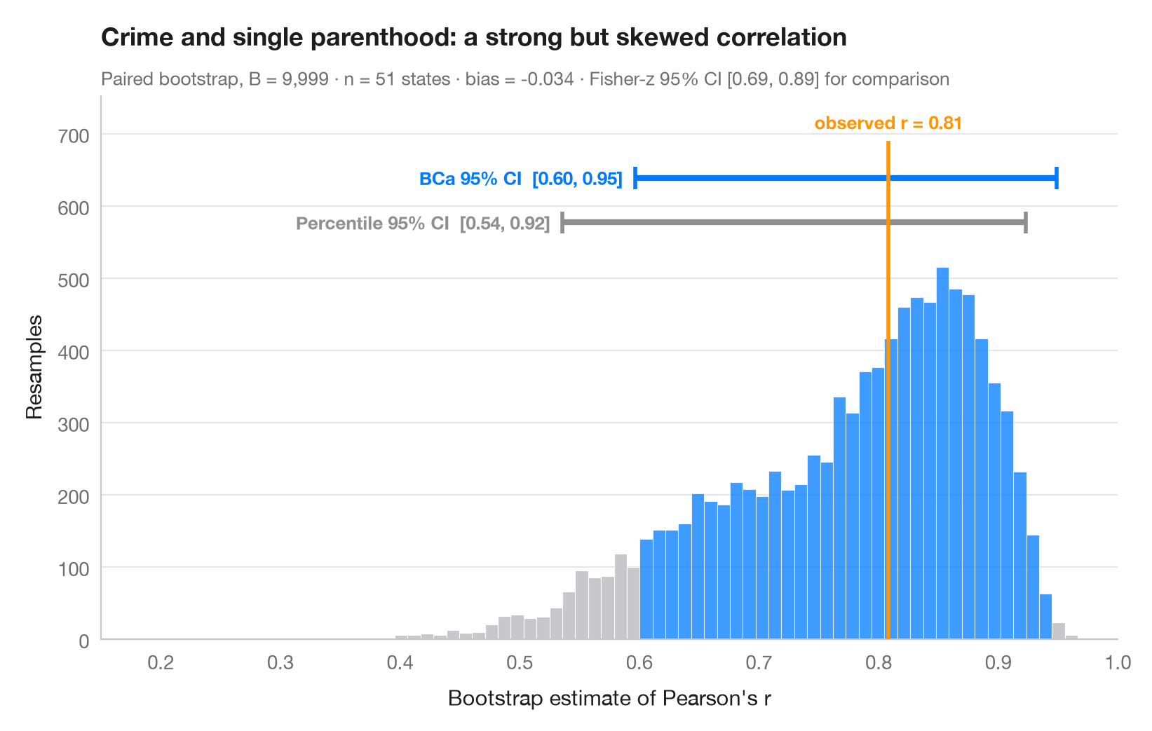
自助法(Bootstrap)在从数据中有放回抽取的数千个样本上重新估计统计量;这些估计值的离散程度即为其抽样不确定性。直方图是相关系数的自助法分布,橙色线是在完整样本中观测到的值。上方绘有两个 95% 区间:简单的百分位数区间,以及 BCa(偏差校正加速)区间——后者会发生偏移,以校正此处可见的偏差和偏度,因为该分布远非对称。
数据为 statsmodels statecrime 数据集中的美国 50 个州 + 哥伦比亚特区:单亲家庭占比与暴力犯罪率。scipy.stats.bootstrap(配对,9,999 次重抽样)给出两种区间。
代码及图中文字均为英文。
import matplotlib.pyplot as plt
import numpy as np
import statsmodels.api as sm
from scipy import stats

# Data: violent crime vs single-parent households, 51 states
df = sm.datasets.statecrime.load_pandas().data
x, y = df["single"].to_numpy(), df["violent"].to_numpy()
r_obs = stats.pearsonr(x, y)[0]

# Paired bootstrap of Pearson's r: percentile and BCa intervals from the same resamples
r = lambda a, b, axis=-1: stats.pearsonr(a, b, axis=axis)[0]
boot = {m: stats.bootstrap((x, y), r, paired=True, vectorized=True, n_resamples=9999,
                           method=m, random_state=np.random.default_rng(7))
        for m in ["percentile", "BCa"]}
dist = boot["BCa"].bootstrap_distribution
fisher = np.tanh(np.arctanh(r_obs) + np.array([-1, 1]) * 1.96 / np.sqrt(len(x) - 3))

fig, ax = plt.subplots(figsize=(8, 5))
lo, hi = boot["BCa"].confidence_interval
counts, edges, bars = ax.hist(dist, bins=60, color="#C7C7CC", edgecolor="white", lw=0.4)
for b, left in zip(bars, edges[:-1]):
    if lo <= left + (edges[1] - edges[0]) / 2 <= hi:
        b.set_facecolor("#007AFF"); b.set_alpha(0.75)

# Intervals stacked above the histogram
top = counts.max()
for i, (m, c, name) in enumerate([("percentile", "#8E8E93", "Percentile"),
                                  ("BCa", "#007AFF", "BCa")]):
    a, b = boot[m].confidence_interval
    yy = top * (1.12 + 0.12 * i)
    ax.plot([a, b], [yy, yy], color=c, lw=3, solid_capstyle="butt")
    ax.vlines([a, b], yy - top * 0.03, yy + top * 0.03, color=c, lw=2)
    ax.text(a - 0.01, yy, f"{name} 95% CI  [{a:.2f}, {b:.2f}]", ha="right", va="center",
            fontsize=9.5, color=c, fontweight="semibold")

ax.vlines(r_obs, 0, top * 1.34, color="#FF9500", lw=2, zorder=3)
ax.text(r_obs, top * 1.36, f"observed r = {r_obs:.2f}", ha="center", va="bottom",
        fontsize=9.5, color="#FF9500", fontweight="semibold")
ax.set_xlim(0.15, 1)
ax.set_ylim(0, top * 1.46)
ax.set_xlabel("Bootstrap estimate of Pearson's r")
ax.set_ylabel("Resamples")
ax.set_title("Crime and single parenthood: a strong but skewed correlation", pad=26)
ax.text(0, 1.02, f"Paired bootstrap, B = 9,999 · n = {len(x)} states · bias = "
        f"{dist.mean() - r_obs:+.3f} · Fisher-z 95% CI [{fisher[0]:.2f}, {fisher[1]:.2f}] for comparison",
        transform=ax.transAxes, fontsize=9.5, color="#6E6E73")
plt.show()
图表使用了可选的 PyStatlas 样式:添加 plt.style.use("pystatlas.mplstyle") 即可完全还原其外观。
数据来源
- US state crime and social indicators, 2009. U.S. Census Bureau. Statistical Abstract of the United States, state tables for 2009 (crime rates from the FBI Uniform Crime Reporting program). https://www.statsmodels.org/stable/datasets/generated/statecrime.html
Compiled for statsmodels (sm.datasets.statecrime); public domain. See the statsmodels page for each variable's table and footnotes.
这些示例用于说明统计方法。图表标题描述的是该图在这些特定数据中呈现的内容——这些数据往往样本较小、年代较早或并不完整——而不是作者对实质问题的立场。关于解释、背景和数据质量,请以此处引用的原始来源为准。
如何引用
PyStatlas 由 Thierry Warin 创建并维护。如果它对你的工作有所帮助,敬请引用。
Warin, T. (2026). Bootstrap distribution. In PyStatlas: A Python Gallery of Statistical Graphics for the Social Sciences. https://warint.github.io/pystatlas/inference-uncertainty/bootstrap-distribution/
@misc{warin2026statlas,
  author       = {Warin, Thierry},
  title        = {PyStatlas: A Python Gallery of Statistical Graphics for the Social Sciences},
  year         = {2026},
  howpublished = {\url{https://warint.github.io/pystatlas/}},
  note         = {Source code: https://github.com/warint/pystatlas}
}更多推断与不确定性图表
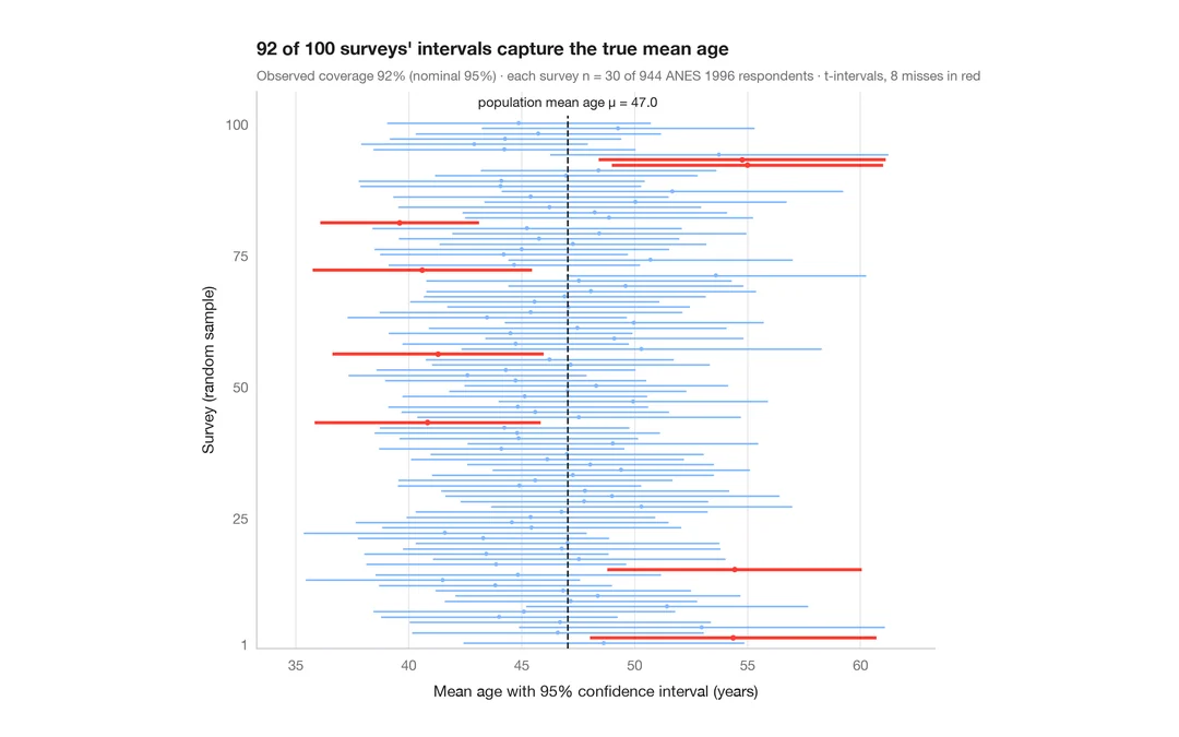
95% 置信区间的含义
从 944 名 ANES 受访者中抽取 30 人,重复调查 100 次;未覆盖真值的平均年龄 95% 置信区间以红色显示。
teaching classic (e.g. TeachingDemos::ci.examp())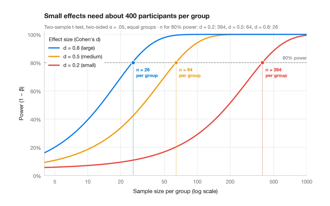
统计功效曲线
小、中、大效应下双样本 t 检验的统计功效随样本量的变化。
pwr::pwr.t.test() + plot()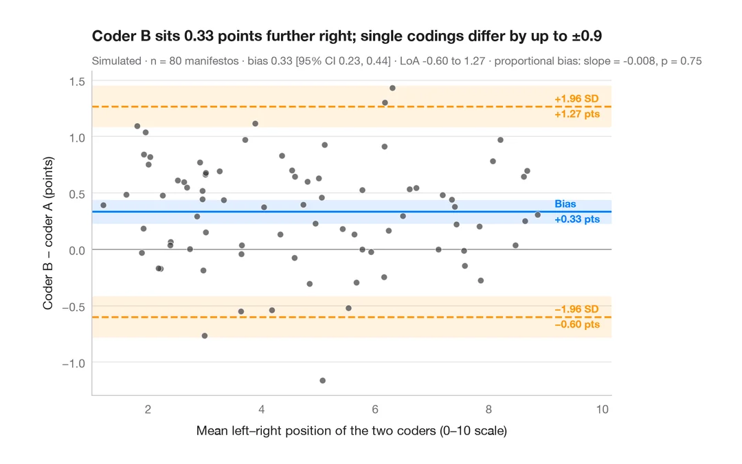
Bland–Altman 图
两位编码员对政党竞选纲领左右立场的定位是否一致?偏差与 95% 一致性界限。
BlandAltmanLeh::bland.altman.plot() / blandr::blandr.draw()