Scatterplot with statistics
Low-income pupils vs math results in 303 California districts — scatter, OLS line with 95% band, marginal histograms and Pearson's r.
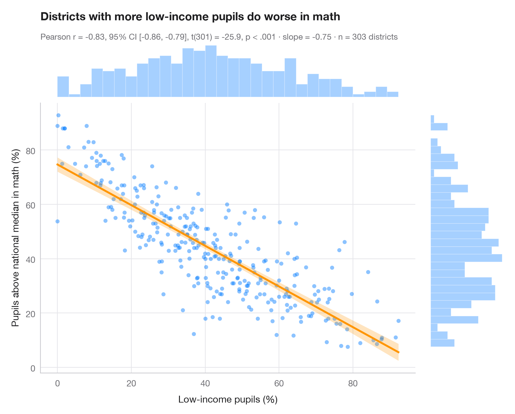
The Python counterpart of ggscatterstats(). The central panel shows every
observation with the least-squares line and its 95% confidence band (uncertainty
about the mean of y at each x, not about individual points). Marginal
histograms on the top and right reveal the shape of each variable, which a
correlation coefficient silently assumes is reasonable. The subtitle reports
Pearson's r with its 95% confidence interval, the t-test, the OLS slope and
the sample size.
Data are the 303 California school districts of the STAR98 test bundled with
statsmodels (sm.datasets.star98): the share of low-income pupils against
the share of tested pupils scoring above the national median in mathematics,
computed as NABOVE / (NABOVE + NBELOW). The slope of −0.75 means about
7.5 points fewer pupils above the median for every 10 points more low-income
pupils — an association between districts, not an effect. The test comes from
scipy.stats.pearsonr, the line and band from statsmodels OLS
get_prediction().conf_int().
import matplotlib.pyplot as plt
import numpy as np
import statsmodels.api as sm
from scipy import stats

# Data: low-income pupils and math results in 303 California school districts
data = sm.datasets.star98.load_pandas().data
x = data["LOWINC"].to_numpy()
y = (100 * data["NABOVE"] / (data["NABOVE"] + data["NBELOW"])).to_numpy()
n = len(x)

# Pearson correlation with its 95% CI
res = stats.pearsonr(x, y)
ci = res.confidence_interval(0.95)

# OLS fit and 95% confidence band for the mean
fit = sm.OLS(y, sm.add_constant(x)).fit()
grid = np.linspace(x.min(), x.max(), 200)
band = fit.get_prediction(sm.add_constant(grid)).conf_int(alpha=0.05)

fig = plt.figure(figsize=(8, 6.4))
gs = fig.add_gridspec(2, 2, width_ratios=(5, 1), height_ratios=(1, 5), wspace=0.03, hspace=0.03)
ax = fig.add_subplot(gs[1, 0])
ax_top = fig.add_subplot(gs[0, 0], sharex=ax)
ax_right = fig.add_subplot(gs[1, 1], sharey=ax)

ax.scatter(x, y, s=22, color="#007AFF", alpha=0.45, lw=0)
ax.fill_between(grid, band[:, 0], band[:, 1], color="#FF9500", alpha=0.25, lw=0)
ax.plot(grid, fit.params[0] + fit.params[1] * grid, color="#FF9500", lw=2.2)
ax.set_xlabel("Low-income pupils (%)")
ax.set_ylabel("Pupils above national median in math (%)")
ax.grid(axis="x")

# Marginal histograms
ax_top.hist(x, bins=30, color="#007AFF", alpha=0.35, edgecolor="white")
ax_right.hist(y, bins=30, color="#007AFF", alpha=0.35, edgecolor="white", orientation="horizontal")
for a in (ax_top, ax_right):
    a.axis("off")

ax_top.set_title("Districts with more low-income pupils do worse in math", pad=26)
p_txt = "p < .001" if res.pvalue < 0.001 else f"p = {res.pvalue:.3f}"
ax_top.text(0, 1.06, f"Pearson r = {res.statistic:.2f}, 95% CI [{ci.low:.2f}, {ci.high:.2f}], "
            f"t({n - 2}) = {fit.tvalues[1]:.1f}, {p_txt} · slope = {fit.params[1]:.2f} · n = {n} districts",
            transform=ax_top.transAxes, fontsize=9.5, color="#6E6E73")
plt.show()
Figures use the optional PyStatlas style: add plt.style.use("pystatlas.mplstyle") to match the look exactly.
Data source
- California STAR test results, 1998 (303 school districts). Gill, J. (2001). Generalized Linear Models: A Unified Approach (Quantitative Applications in the Social Sciences, No. 134). Sage. https://www.statsmodels.org/stable/datasets/generated/star98.html
Original data from the California Department of Education's Standardized Testing and Reporting (STAR) program, 1998. Subset distributed with statsmodels (sm.datasets.star98) with the author's permission.
The examples illustrate statistical methods. Their titles describe what each figure shows in these particular data — often a small, dated or partial sample — not the author's position on the substantive question. For interpretation, context and data quality, rely on the original sources cited here.
How to cite
PyStatlas is created and maintained by Thierry Warin. If it helped your work, please cite it.
Warin, T. (2026). Scatterplot with statistics. In PyStatlas: A Python Gallery of Statistical Graphics for the Social Sciences. https://warint.github.io/pystatlas/correlation/scatter-with-stats/
@misc{warin2026statlas,
  author       = {Warin, Thierry},
  title        = {PyStatlas: A Python Gallery of Statistical Graphics for the Social Sciences},
  year         = {2026},
  howpublished = {\url{https://warint.github.io/pystatlas/}},
  note         = {Source code: https://github.com/warint/pystatlas}
}More in Correlation & association
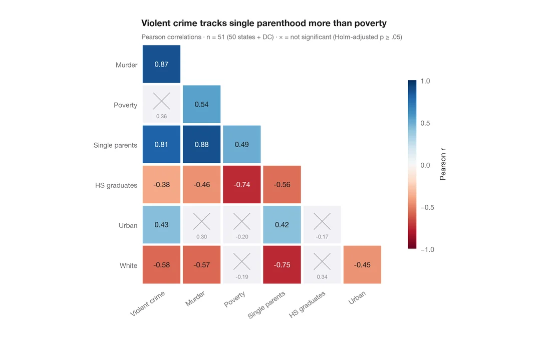
Correlation matrix
Lower-triangle Pearson correlation heatmap; non-significant cells (Holm) are crossed out.
ggstatsplot::ggcorrmat()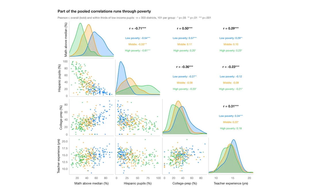
Pairs plot with correlations
Scatter matrix of four school-district variables, with group KDEs on the diagonal and pooled vs within-group correlations above it.
GGally::ggpairs()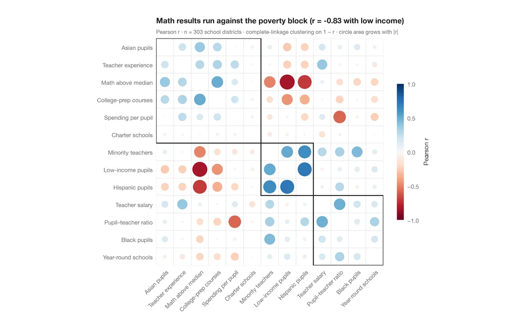
Correlogram with clustering
Corrplot-style circles sized and coloured by r for 13 school-district indicators, ordered by hierarchical clustering.
corrplot::corrplot(order = "hclust", addrect = 3)