Mosaic plot with Pearson residuals
Tile areas proportional to cell counts, shaded by Pearson residuals from independence.
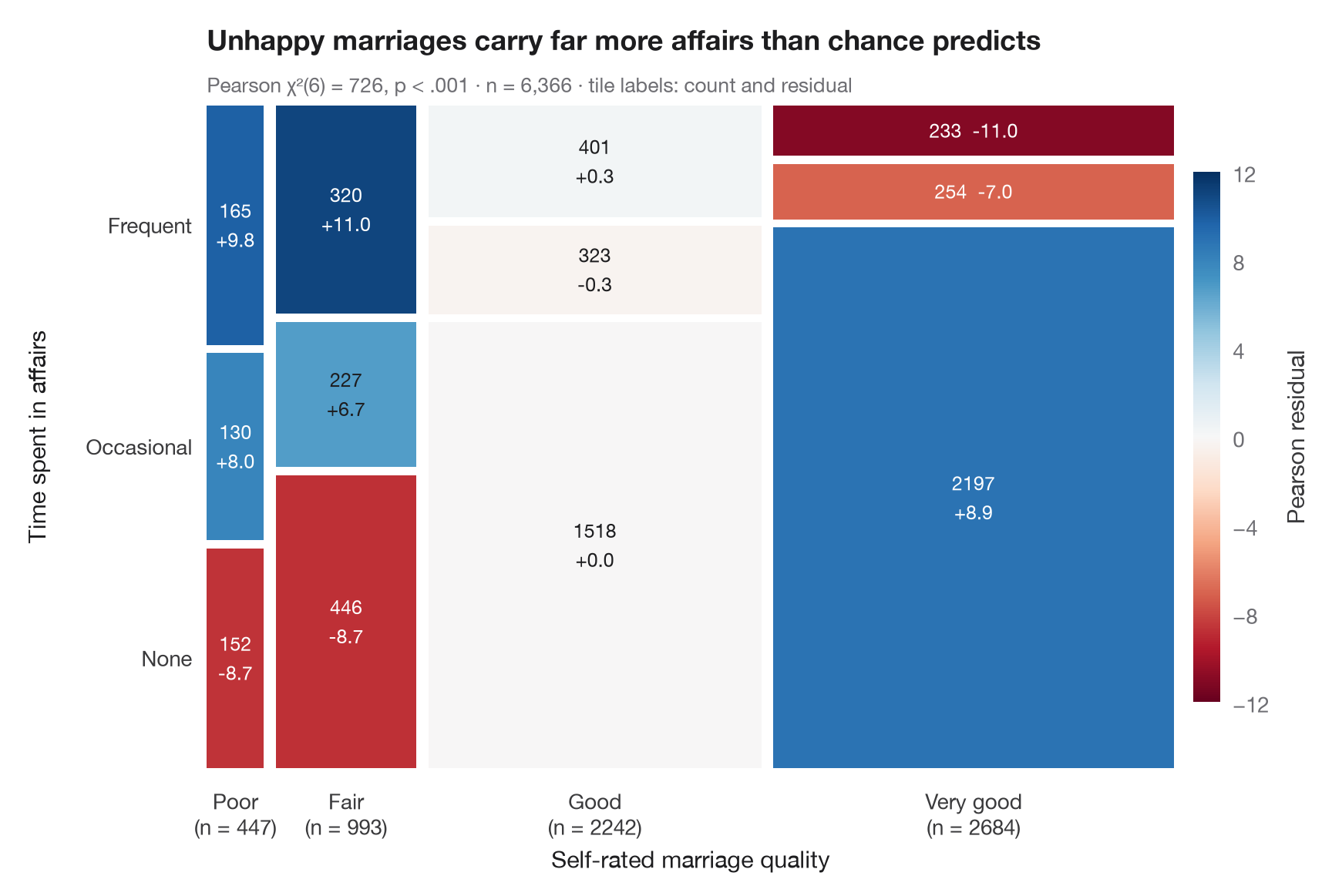
A mosaic plot draws a two-way table as a square cut into tiles. Column widths
are the marginal shares of the first variable, tile heights the conditional
shares of the second, so every tile's area is proportional to its count. As in
vcd::mosaic(shade = TRUE), the colour is the Pearson residual
(observed − expected) / √expected: blue tiles hold more people than independence
predicts, red tiles fewer, and residuals beyond ±2 or ±4 flag the cells that drive χ².
Data are the 1974 Redbook survey of 6,366 married women bundled with
statsmodels (sm.datasets.fair): self-rated marriage quality against time
spent in extramarital affairs. The tiles are drawn by hand with ax.bar;
expected counts come from scipy.stats.chi2_contingency.
import matplotlib.pyplot as plt
import numpy as np
import pandas as pd
import statsmodels.api as sm
from matplotlib.colors import TwoSlopeNorm
from scipy import stats

# Data: marriage rating (1-5, 1-2 pooled) × time spent in affairs (none / ≤ 1 / > 1)
df = sm.datasets.fair.load_pandas().data
rating = pd.cut(df.rate_marriage, [0, 2, 3, 4, 5], labels=["Poor", "Fair", "Good", "Very good"])
affairs = pd.cut(df.affairs, [-1, 0, 1, np.inf], labels=["None", "Occasional", "Frequent"])
table = pd.crosstab(rating, affairs)
obs = table.to_numpy()

# Chi-squared test and Pearson residuals
chi2, p, dof, expected = stats.chi2_contingency(obs, correction=False)
resid = (obs - expected) / np.sqrt(expected)

fig, ax = plt.subplots(figsize=(8.5, 5.6))
cmap = plt.get_cmap("RdBu")                         # red = fewer than expected, blue = more
norm = TwoSlopeNorm(0, vmin=-12, vmax=12)
gap = 0.012
widths = obs.sum(axis=1) / obs.sum()
x0 = 0
for i, w in enumerate(widths):
    heights = obs[i] / obs[i].sum()
    y0 = 0
    for j, h in enumerate(heights):
        ax.bar(x0, h - gap, width=w - gap, bottom=y0, align="edge",
               color=cmap(norm(resid[i, j])), edgecolor="none")
        sep = "  " if h < 0.12 else "\n"              # thin tiles get a one-line label
        ax.text(x0 + (w - gap) / 2, y0 + (h - gap) / 2, f"{obs[i, j]}{sep}{resid[i, j].round(1) + 0:+.1f}", ha="center", va="center",
                fontsize=9, linespacing=1.3, color="white" if abs(resid[i, j]) > 7 else "#1D1D1F")
        y0 += h
    ax.text(x0 + (w - gap) / 2, -0.03, f"{table.index[i]}\n(n = {obs[i].sum()})", ha="center", va="top",
            fontsize=10, color="#3A3A3C")
    x0 += w

# Row labels on the left, placed at the heights of the first column
y0 = 0
for j, h in enumerate(obs[0] / obs[0].sum()):
    ax.text(-0.015, y0 + (h - gap) / 2, table.columns[j], ha="right", va="center", fontsize=10, color="#3A3A3C")
    y0 += h

sm_ = plt.cm.ScalarMappable(norm=norm, cmap=cmap)
cb = fig.colorbar(sm_, ax=ax, shrink=0.8, pad=0.02, ticks=[-12, -8, -4, 0, 4, 8, 12])
cb.set_label("Pearson residual", color="#3A3A3C")
cb.outline.set_visible(False)
ax.set_xlim(0, 1 - gap); ax.set_ylim(0, 1 - gap)
ax.axis("off")
ax.text(0.5, -0.15, "Self-rated marriage quality", transform=ax.transAxes, ha="center", fontsize=11)
ax.text(-0.19, 0.5, "Time spent in affairs", transform=ax.transAxes, rotation=90, va="center", fontsize=11)
ax.set_title("Unhappy marriages carry far more affairs than chance predicts", pad=26)
ax.text(0, 1.02, f"Pearson χ²({dof}) = {chi2:.0f}, p < .001 · n = {obs.sum():,} · "
        "tile labels: count and residual", transform=ax.transAxes, fontsize=9.5, color="#6E6E73")
plt.show()
Figures use the optional PyStatlas style: add plt.style.use("pystatlas.mplstyle") to match the look exactly.
Data source
- Redbook survey of married women, 1974 (Fair's affairs data). Fair, R. C. (1978). A theory of extramarital affairs. Journal of Political Economy, 86(1), 45–61. https://doi.org/10.1086/260646
Data from the 1974 Redbook magazine survey; distributed with statsmodels (sm.datasets.fair) with the author's permission.
The examples illustrate statistical methods. Their titles describe what each figure shows in these particular data — often a small, dated or partial sample — not the author's position on the substantive question. For interpretation, context and data quality, rely on the original sources cited here.
How to cite
PyStatlas is created and maintained by Thierry Warin. If it helped your work, please cite it.
Warin, T. (2026). Mosaic plot with Pearson residuals. In PyStatlas: A Python Gallery of Statistical Graphics for the Social Sciences. https://warint.github.io/pystatlas/proportions-surveys/mosaic-plot/
@misc{warin2026statlas,
  author       = {Warin, Thierry},
  title        = {PyStatlas: A Python Gallery of Statistical Graphics for the Social Sciences},
  year         = {2026},
  howpublished = {\url{https://warint.github.io/pystatlas/}},
  note         = {Source code: https://github.com/warint/pystatlas}
}More in Proportions & surveys
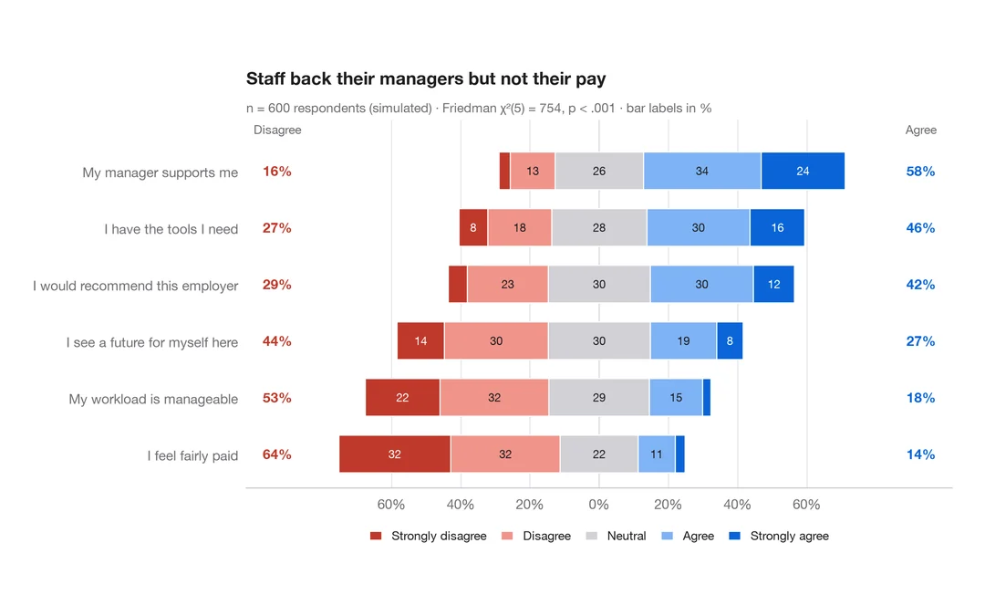
Diverging Likert chart
Five-point Likert items as diverging stacked bars centred on the neutral answer.
ggstats::gglikert()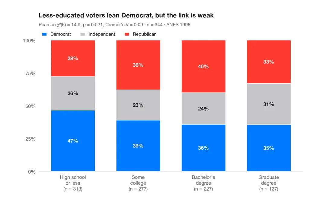
Stacked proportions by group
100% stacked bars with percentage labels, n per bar, chi-squared test and Cramér's V.
ggstatsplot::ggbarstats()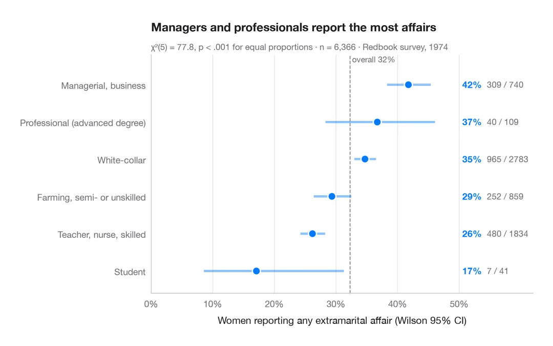
Proportions with confidence intervals
A sorted dot plot of group proportions with Wilson 95% confidence intervals.
ggstats::stat_prop() + geom_errorbar()