EpiBibR’s Reproducible Bibliometric Material
Thierry Warin
Source:vignettes/reproducibleMaterial.Rmd
reproducibleMaterial.RmdBibliometric Analysis
The Bibliometrix package allows a thorough bibliometric analysis using R. Our EpiBib data have been designed to integrate easily with the Bibliometrix package. A shinyapp is also available biblioshiny().
Biblioshiny
The biblioshiny function has been developed to assist people in their bibliometric analysis. By its user-friendly interface, biblioshiny facilitates the use of Bibliometrix’s main analysis tools and allows the creation of graphs and visuals.
Biblioshiny : Procedure and Examples
This procedure is based on the one made by the creators of the Bibliometrix package (Aria and Cuccurullo 2017).
Step 1 - Load the Bibliometrix package and load the biblioshiny function
Step 2 - Download an example at the following link . It includes all articles published by the Journal of Informetrics from 2007 to 2017.
Step 2 - In the Load menu, select ‘Web of Knowledge’ as database and ‘Plaintext’ as file format.
Step 3 - Choose and load the file joi.zip using the browse button.
Step 4 - Try the shiny app to create analytics and plots for three different level metrics and analysis of three structures of Knowledge (K-structures).
An Algorithmic Systematic Literature Review of EpiBibR
By using Bibliometrix tools to analyse our EpiBibR’s data, we were able to propose a simple count of the references on the coronaviruses literature and even upgrade the original visuals.
# Load the packages
library(EpiBibR)
library(bibliometrix)

# Retrieve EpiBib_data for 2020
M <- epibibr_data(year = "2020")


# Summary bibliometric results
results <- biblioAnalysis(M, sep = ";")
S <- summary(object = results, k = 10, pause = FALSE)
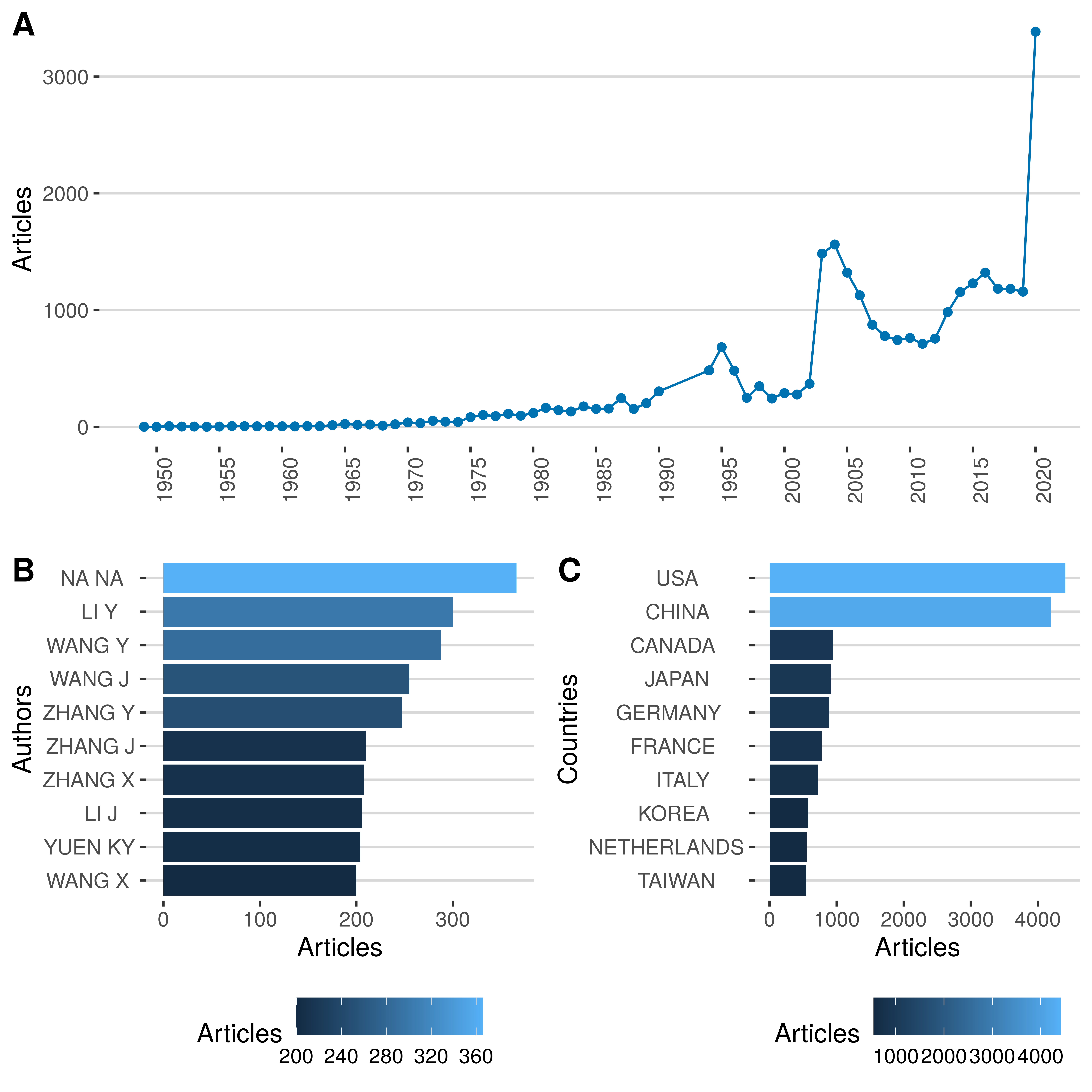
Summary includes info such as the number of documents, the most productive authors, the most productive countries and the count of articles per year. To assist in understanding this summary, we have created these three grapics.
# Most Productive Authors

library(bibliometrix)
library(reshape2)
library(ggplot2)
library(ggsci)
library(tidyverse)
library(plyr)
library(ggthemes)
library(cowplot)

df <- plyr::ldply(S, data.frame)
df <- subset(df, .id == "MostProdAuthors", select = c(Articles, Authors.......))
df <- df %>% dplyr::rename(Authors = Authors.......)

df$Articles <- as.numeric(df$Articles)
df$Authors <-as.factor(df$Authors)

p1 <- ggplot(df, aes(x = reorder(Authors, Articles), y = Articles, fill = Articles)) +
  geom_bar(stat="identity") +
  coord_flip() +
  labs(x = "Authors") +
  theme_hc()

rm(df)

# Most Productive Countries

df <- plyr::ldply(S, data.frame)
df <- subset(df, .id == "MostProdCountries", select = c(Articles, Country))

df$Articles <- as.numeric(df$Articles)
df$Country <-as.factor(df$Country)

p2 <- ggplot(df, aes(x = reorder(Country, Articles), y = Articles, fill = Articles)) +
  geom_bar(stat="identity") +
  coord_flip() +
  labs(x = "Countries") +
  theme_hc()

rm(df)

# Count of articles per year

df <- plyr::ldply(S, data.frame)
df <- subset(df, .id == "AnnualProduction", select = c(Year..., Articles))
df <- df %>% dplyr::rename(Year = Year...)

df$Year <- as.numeric(as.character(df$Year))
df$Articles <- as.numeric(df$Articles)


p3 <- ggplot(df, aes(x = Year, y = Articles, colour = cond)) +
  geom_line(colour = "#0072B2") +
  geom_point(colour = "#0072B2") +
  labs( x = "") +
  theme(axis.text.x = element_text(angle = 90, hjust = 1)) +
  scale_x_continuous(breaks = seq(1950,2020, 5)) +
  theme_hc()

rm(df)
ggdraw() +
  draw_plot(p3, 0, .5, 1, .5) +
  draw_plot(p1, 0, 0, .5, .5) +
  draw_plot(p2, .5, 0, .5, .5) +
  draw_plot_label(c("A", "B", "C"), c(0, 0, 0.5), c(1, 0.5, 0.5), size = 15)
- Count of Articles, (B) Most Productive Authors and (C) Most Productive Countries
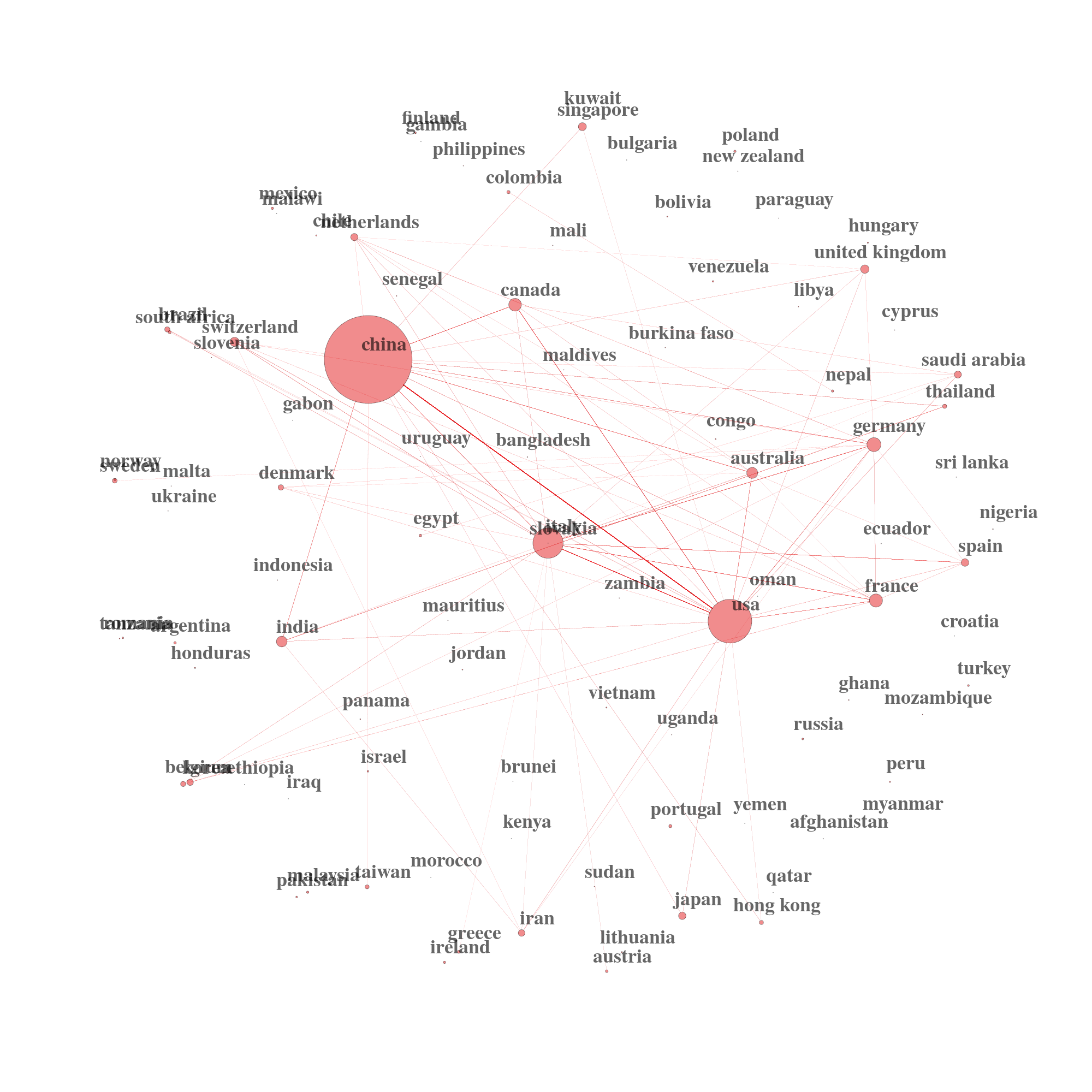
We can also use powerful techniques such as Social Network Theory to find potential clusters of topics, clusters of researchers and clusters of country collaborations. The U.S. and China produce the bulk of the research on coronaviruses.
# Country Collaboration Network
M <- metaTagExtraction(M, Field = "AU_CO", sep = ";")
NetMatrix <- biblioNetwork(M, analysis = "collaboration", network = "countries", sep = ";")

# Plot the network

net1 = networkPlot(NetMatrix, n = dim(NetMatrix)[1], Title = "", type = "sphere", size=TRUE, remove.multiple=FALSE, labelsize=3, cluster="none")
Country Collaboration Network